Bringing ADA Signs into the 21st Century
When is the last time you referenced an ADA sign – those signs outside of pretty much every room in every public building in the United States? Even though these days they seem ubiquitous, they are an important and fairly recent accessibility requirement that many of us depend on when we’re in an unfamiliar space.
In this post, we’re going to do a deep dive into how ADA signs came to be and how they’re used today. We’ll also discuss some of the limitations of the ADA sign and how WayAround is bringing the ADA sign into the 21st century.
What is the ADA?
To understand the significance of the ADA today, it’s worth looking at its history. At its core, the ADA is about civil rights. The Act is far-reaching and includes regulations to prevent discrimination against people with any type of disability. The ADA was signed into law on July 26, 1990 by George H. W. Bush, and it’s updated at least every five years.
Before the ADA, there was the Rehabilitation Act of 1973. This is the birthplace of what we now know as ADA Signs.
You’ve probably heard of Section 504 of the Rehabilitation Act of 1973. This law was the first law to prevent discrimination against people with disabilities. It came on the heels of the Civil Rights movement. It’s notable that in 1973, the Rehabilitation Act applied only to organizations that received federal funding. Until the ADA was signed into law in 1990, there were no federal laws prohibiting private sector discrimination against people with disabilities.
The Rehabilitation Act of 1973 also created the Architectural and Transportation Barriers Compliance Board, or the Access Board. The Access Board is an independent federal agency tasked with promoting accessibility and removing barriers for individuals with disabilities in various environments, including architecture and transportation. The Access Board developed guidelines, issued standards, and in some cases issued regulations.
The Access Board was the organization that first created regulations for accessible signage. Today, the Access Board reviews and updates guidelines about signage and other features in the built environment.
Requirements for ADA Signs
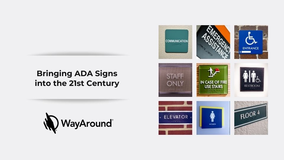
The ADA has very specific requirements for ADA signs, including when Braille is required, contrast, spacing, fonts, and placement. Architectural signage is the term most commonly used for the types of signs that fall under ADA regulations.
Signage that identifies a space, room, or area, including the exits, within a facility must include Braille and meet other requirements for size and contrast. For example, identification signage at a restroom must include a pictogram – those geometric human figures that may be wearing a dress or pants.
Placement for ADA signs is important. Ideally, the sign should be located on the handle or latch side of the door or at the right side of double doors. There are many instances where meeting this ideal is not possible, and the ADA describes alternative placements in those instances.
Other types of architectural signage are not for identification but serve another purpose:
- Signs that provide information about a space do not require Braille, but must meet size and contrast requirements for low vision.
- Directional and wayfinding signage have their own set of requirements, but do not require Braille.
- Overhead signage, like emergency exit signs, must be high contrast. Braille is not required.
It’s also important to note that there are many types of signage that do not fall under ADA. For example, marketing signs and temporary signs that are installed for fewer than seven days are not required to be accessible.
Common Mistakes for ADA Signs
Compliance for ADA signs can be tricky. Buildings are not designed with ADA signs in mind, so the ideal standard is not always possible. These are some of the most common mistakes for ADA signs that we see.
ADA Signs are too High
ADA signs should be between 48 and 60 inches from the ground. Braille readers need to be able to comfortably reach to read the Braille. It’s not uncommon for ADA signs to be placed at 6 or 7 feet high – well above most people’s heads. Even placing an ADA sign at 60 inches, which meets the regulation, can be challenging for a Braille reader who also uses a wheelchair.
Braille is Wrong
When it comes to Braille, most of us are illiterate. That means we wouldn’t know if the Braille is upside down, mirrored, or just plain wrong. Unfortunately, Braille mistakes happen too frequently. Elevator buttons are one of the most frequent offenders.
ADA Signs on the Back of the Door
This is a tricky one, because the ADA says that there are times it is acceptible to put ADA signs on the back of a door. So while it may not technically be a mistake, it’s certainly not ideal.
As a matter of practicality, placing an ADA sign on the back of a door can be inconvenient and dangerous. For a Braille reader, they could be hit by the door or interrupted when someone opens the door from the other side. There are times when there’s no available wall space. However, if you can avoid putting the ADA sign on the back of a door, it’s best to find another location.
Compliance vs Usefulness
ADA compliance is not an easy task in part because there are so many nuances to the regulations. The regulations also change, so what was once fully compliant may no longer meet updated standards.
Facilities that make a concerted effort to comply with ADA signage requirements should be commended. At the same time, ADA compliance for signage will not make any facility fully accessible to someone with low vision or no vision. There are some real limitations of ADA signs that keep them from being useful to as many people as possible.
Not Enough Room
Printed text takes up a lot of space. Whether it’s letters or dots, there’s usually only enough room for one or two words on ADA signage. Sometimes a word or phrase is all that’s needed, but not always. For example, a sign that says Suite 102 doesn’t tell you who works in Suite 102 or whether that business is currently open.
Aesthetics
ADA signs look more or less the same everywhere. You can slightly alter the color combination, as long as you only use two colors and there’s enough contrast between them. But there isn’t a lot of room for creativity. In fact, clever signage is usually non-compliant signage.
Some designers are going large scale, especially with pictograms at the restrooms. Several airports have nearly life-sized pictograms at the entrances to restrooms. These can be helpful for people with some vision. However, for Braille readers or people with limited useable vision, the traditional ADA sign with a tactile pictogram is most helpful.
Not All Signs Are Accessible
It’s surprising which signs DON’T fall under ADA requirements to be fully accessible even for someone with no vision. The emergency exit maps on the back of a hotel door are a good example. Many blind people aren’t even aware these exist, and don’t have a way to access this important safety information.
If you look around at the signage in any facility, chances are it all serves a purpose: to inform, to direct, to inspire, to educate, or something else. A lot of it isn’t useable by someone with limited eyesight, reading difficulties, or other disabilities.
Marrying Physical ADA Signs with Accessible Digital Technology
When the ADA passed in 1990, it expanded the types of businesses that were required to provide accessible signage. Thirty years later, the amount of information that we expect to be readily available has increased greatly. There’s an opportunity to make signage work much better.
Digital directories or billboard signage can supplement the information available on ADA signage, and it can be easily updated. But this type of digital information isn’t accessible to everyone.
Smartphones have the opportunity to again significantly expand accessible information in the built environment. Digital information presented on a smartphone can be presented according to the users’ accessibility preferences, making it easier to accommodate a wide range of abilities.
In order for the information presented on a smartphone to be useful and trustworthy, it must be linked directly to the physical environment.
Here’s why: Consider driving using GPS. These days, GPS is really accurate. But how many of us still look at the exit sign to be sure we’re going the right direction. It’s similar with digital information. You still need a tie to the physical world in order to confirm that the information is accurate.
WayAround is bringing the ADA sign into the 21st century. WaySigns provide an ideal supplement to traditional ADA signs to help businesses go beyond compliance and provide safety, dignity, and independence to their employees and guests.
Subscribe today for more WayAround tips and tricks!
Want to get tips, tricks, and news from WayAround delivered directly to your inbox? Subscribe today to get the latest! We will never spam you, and you can unsubscribe at any time.


