Five Tips for Being More Inclusive Online
Lately, we’ve been sharing some of our favorite accessibility tips on Facebook and Twitter. We’ve had such a positive response that we decided to gather up our favorite tips in one easy-to-find blog post!
The internet can be a powerful accessibility tool. Yet, we know too well that it can also leave out people with low or no vision. Once we started sharing tips for inclusivity on social media, our fantastic community chimed in with tips of their own! Here is a roundup of five of our favorite online accessibility tips.
Feel free to share with friends and family who WANT to be more inclusive online, but may need some encouragement on how to do so.
1. Add alt text
If you’re sighted, photos and videos are probably a part of your daily life on social media—but do you take the time to add alt text with image descriptions? A few extra moments of your time will allow your friends who use screen readers to experience the media you post!
Adding alt text (alternative text) is available on most social media platforms, making it easier for our blind and visually impaired friends to experience our photos and videos. Good alt text should describe an image or video like you are describing it to a person without sight.
 2. Make sure your text is readable
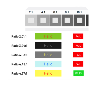
When creating visual content that includes text, remember to keep those with low vision in mind! You can make your text more readable by having a high contrast between the text and background. On websites, contrast ratios should be at least 4.5:1 for normal text and 3:1 for large text. Along with including alt text, this makes your content more accessible!
3. More text, fewer graphics
Text is always better than a graphic! Any content that can be made into text (like menus, item descriptions, policies, etc.) will be more accessible to blind and low vision users by making them available as text!
4. Avoid too many Emojis
Before you open up that emoji keyboard, consider alternatives, like descriptive language!
This doesn’t mean you have to stop using them but use emojis sparingly. Screen reader users don’t get to experience emojis in the same way as sighted users, so emojis may not convey the same meaning to an unsighted user.
5. Put emojis at the end.
Putting emojis in the middle of a sentence can be frustrating for people who use screen readers. Emojis have built-in alt text that is recognized by screen readers, but since emojis are read out loud – “angry face” – putting them in the middle of text can be confusing to screen reader users. It interrupts the flow of the sentence, so try to put any emojis at the end of your post instead!

Subscribe today for more WayAround tips and tricks!
Want to get tips, tricks, and news from WayAround delivered directly to your inbox? Subscribe today to get the latest! We will never spam you, and you can unsubscribe at any time.


